Marketing Materials
About Our Marketing Materials Design Guides
If you are assigned to create Carestream Marketing Materials, please be sure to adhere to these basic Design Guides while building your files. Also, note that in several instances, there are specific templates that must be followed.
If you are reviewing or critiquing materials that have been created for you, please be certain that any content revisions or additions you request can be implemented within the Design Guide framework.
To differentiate Carestream in the healthcare industry, our marketing materials feature strong and engaging visuals, attention-grabbing headlines with concise copy and a consistent core message.
If materials will be used as an integrated campaign, they must present a common look and feel, along with a consistent copy tone. To achieve this, all of our materials – from brochures to print ads to eBlasts – are created in accordance with clean, well-defined Design Guides and templates. This ensures they express a unified, compelling brand identity.
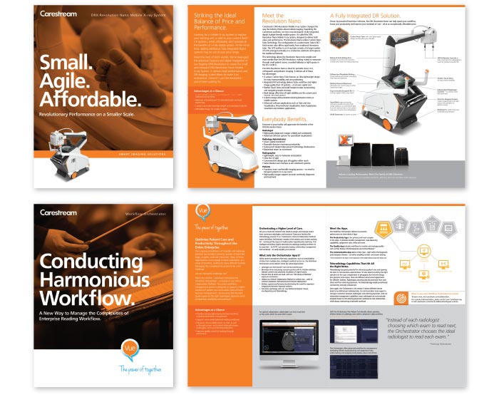
Product Brochure
There are several components that go into building a successful Product Brochure. These templates must be closely adhered to.
Cover Design
Our covers feature bold humanistic/product-in-use imagery, overlaid with Carestream Orange, to engage the reader. Cover copy includes a dominant three-word headline to draw attention and create intrigue.
Brochure Interior
Concise, accessible copy focuses on the benefits each product or service offers the customer. Bullets, call-outs and captions are used frequently to allow easy copy “scanning” for the reader.
A wide variety of supporting product, humanistic and graphic imagery is acceptable. Avoid using images that feature direct eye contact.
Brochure Back
A uniform footer is used on the back page of all brochures to drive Corporate Banding consistency – containing the corporate URL address, social media icons, Masterbrand Mark and required legal copy.
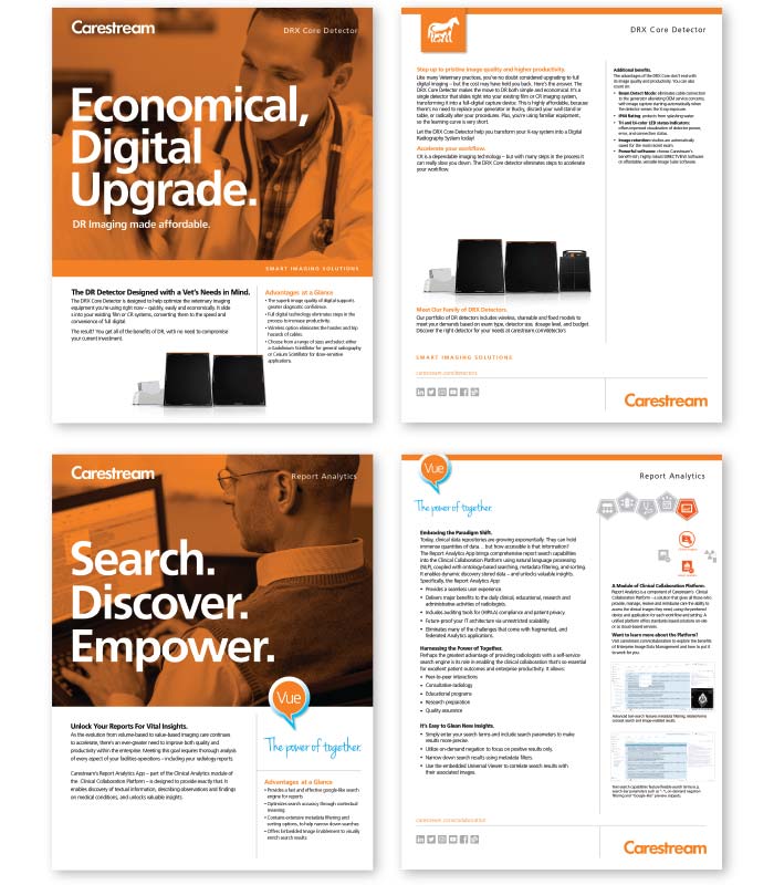
Product Sell Sheet
There are several key components that go into building a successful Product Sell Sheet. These templates must be closely adhered to.
Front Side
Our sell sheet covers feature bold humanistic/ product-in-use imagery, overlaid with Carestream Orange, to engage the reader. Cover copy includes a dominant three-word headline to draw attention and create intrigue. Copy includes a short set of bullets spelling out the Advantages at a Glance.
Back Side
This delivers a more detailed – but still concise – summary of the product features and benefits. A wide variety of supporting product, humanistic and graphic imagery is acceptable. Avoid using images that feature direct eye contact.
A uniform footer – containing the corporate URL address, social media icons, Masterbrand Mark and required legal copy – is used on the back of all sell sheets to drive Corporate Branding consistency.
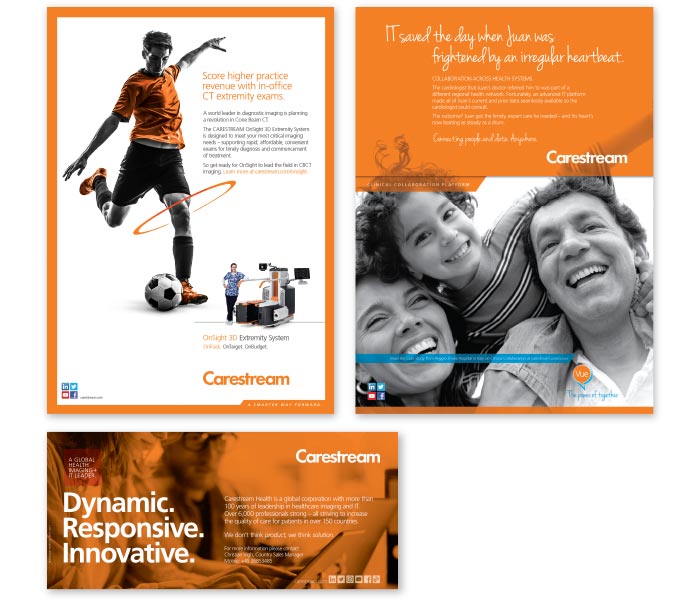
Print Advertising
Building strong, visually engaging print ads is essential to making an impact in the marketplace and differentiating ourselves from our competitors. In our ads, a strong, strategy-based concept works with arresting imagery and engaging copy to deliver a clear and persuasive message. There is design flexibility, but our fundamental brand standards must be maintained.
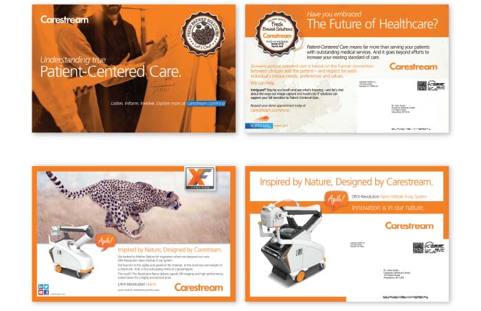
Direct Mail Advertising
Even in the digital age, direct-mail communications remain an impactful tactic, whether alone or as part of a campaign. Our direct mail efforts range from simple, front-and-back postcards all the way to dimensional, 3D mailers. There is design flexibility, but our fundamental brand standards must be maintained.
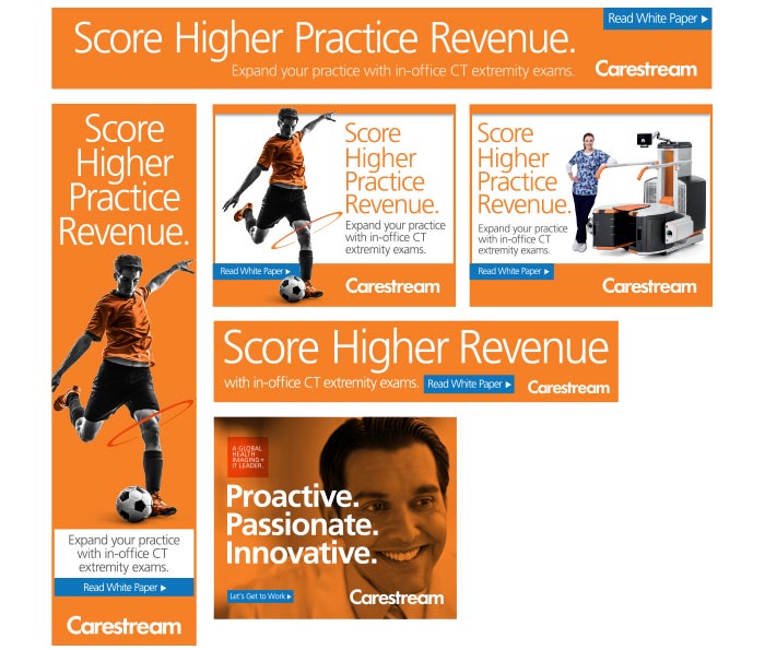
Online Banner Advertising
Our customers are constantly bombarded with online advertising. The key to standing out is to keep our banner ads clean, open and accessible – and focused on a single message. This makes the banner far more likely to entice the viewer to click-through for more information – often delivering them to a custom landing page. The use of a strong call-to-action, connected to a valuable offer, is the key to successful banner performance.
Online banner advertising space comes in a wide variety of shapes and sizes. The banner size will determine whether you use humanistic or product - in-use imagery, or if you only have room for a copy message.
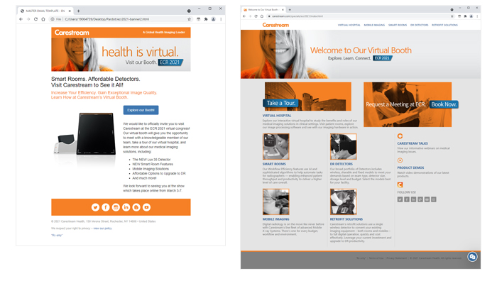
eBlast and Landing Page
An eBlast’s primary message takes center stage – in terms of both the amount of space allocated and its positioning. The majority of the primary message should fall “above the fold” (i.e. the upper half of the page that's visibile without scrolling).
The use of simple, bold imagery is preferred. An offer, if available (a video, white paper, testimonial, etc.) should be clearly identified as an incentive to click-through to the Landing Page. Strive to limit eBlasts to a single message and single call-to-action.
Landing Pages should be designed with the same priorities in mind. The headline and imagery should be identical or at least similar to those of the eBlast to provide continuity. The method for fulfilling the offer must always be extremely clear.
Both eBlasts and landing pages use the social media/ legal footer for consistent corporate branding and to include social media icons and required copyright/ trademark statements.
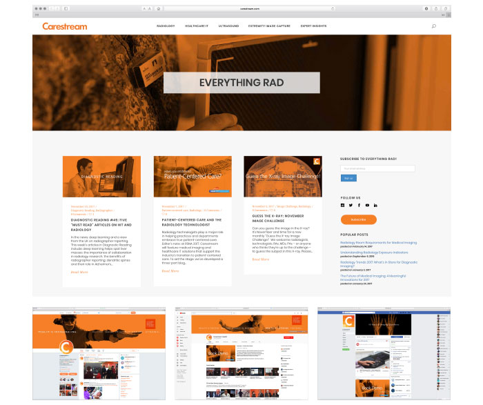
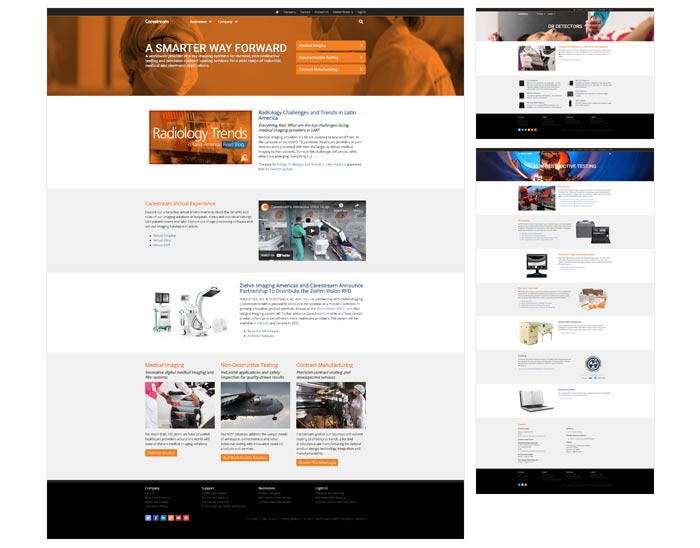
Corporate Website
The Corporate website, www.carestream.com, is the gateway to the entire Carestream portfolio of products and services. This single umbrella site provides one location for all of our brands and subsidiaries.

A web-submission form for both NEW content and CHANGES to existing content can be found on the Carestream InFocus Intranet site under the Marketing Tab.
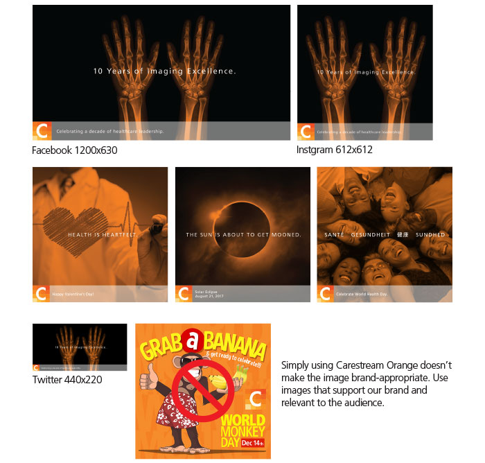
Social Media Marketing
has achieved a strong presence on a group of leading Social Media sites. But while Facebook, Twitter and others are known for informal, casual or spontaneous posts, Carestream strives for an appropriate, business-like tone in our online messaging – balancing the energy of Social Media with the professional branding we’re known for.
And of course, all images used on Social Media must adhere to our brand guidelines, to communicate our professionalism. All images posted must also be sized correctly to meet each site’s particular image specifications.
Our Avatars
On Social Media, the two avatars below are used in place of the Carestream logo. They serve as simple, distinctive “badges” that signify our ownership of the web page. These avatars are for Social Media use only and are NEVER to be used in any way other than branding a site or image used for Social Media.
Social Media Sites
online presence extends across all the Social Media sites listed here. The lineup of the Social Media icons is used in the order you see here. Each icon is a live link in the footer of PDFs we distribute electronically.
Social Media Website Branding
The branding guidelines that govern our traditional marketing materials must also be adhered to across all of our Social Media sites. All sites are designed and managed by the Carestream Corporate Design Team to ensure and drive brand consistency.